Anyone who’s ever spent idle minutes quizzing a globe-trotting friend, squinting at inflight maps, or nervously sweating out “Geography” in pub trivia knows that world maps are, if nothing else, persistent. The Mercator projection, with its expanse of swooping lines and Greenland masquerading as some kind of frozen behemoth, is everywhere—physically in classrooms, digitally stitched into GPS displays, maybe even hiding on the coffee cup beside your laptop. But if you thought that trusty old map had your back, consider this: you’ve been looking at a funhouse mirror, not a window.
As CNN reports, world leaders and advocacy groups—led by the African Union—are calling for the Mercator’s retirement party. Not quietly, either. This is less a gentle nudge and more the cartographic equivalent of flipping the game board.
The Mercator Problem: When North Is Big and South Is…Not
The Mercator projection, in case your ninth-grade geography class and the barely-used globe in the attic don’t have the details fresh, was developed in the 16th century by Gerardus Mercator. It made navigation for sailors easier, which was handy in the Age of European Exploration. Perfectly practical if you’re plotting a route by compass—not so practical if you’re trying to get a sense of how big Africa, or indeed anywhere not north of Belgium, really is.
According to Uzalo News, Mercator’s design drastically inflates regions near the poles—Europe, North America, Greenland—and shrinks those closer to the equator, with Africa and South America the major casualties. Try this at home: take a tape measure and run it across Greenland and Africa on your classroom wall map. If you believe Mercator, Greenland could almost swallow Africa. In reality? Africa is nearly 14 times larger. It’s a distortion so persistent, it makes you wonder what other travesties your primary school globes have perpetrated.
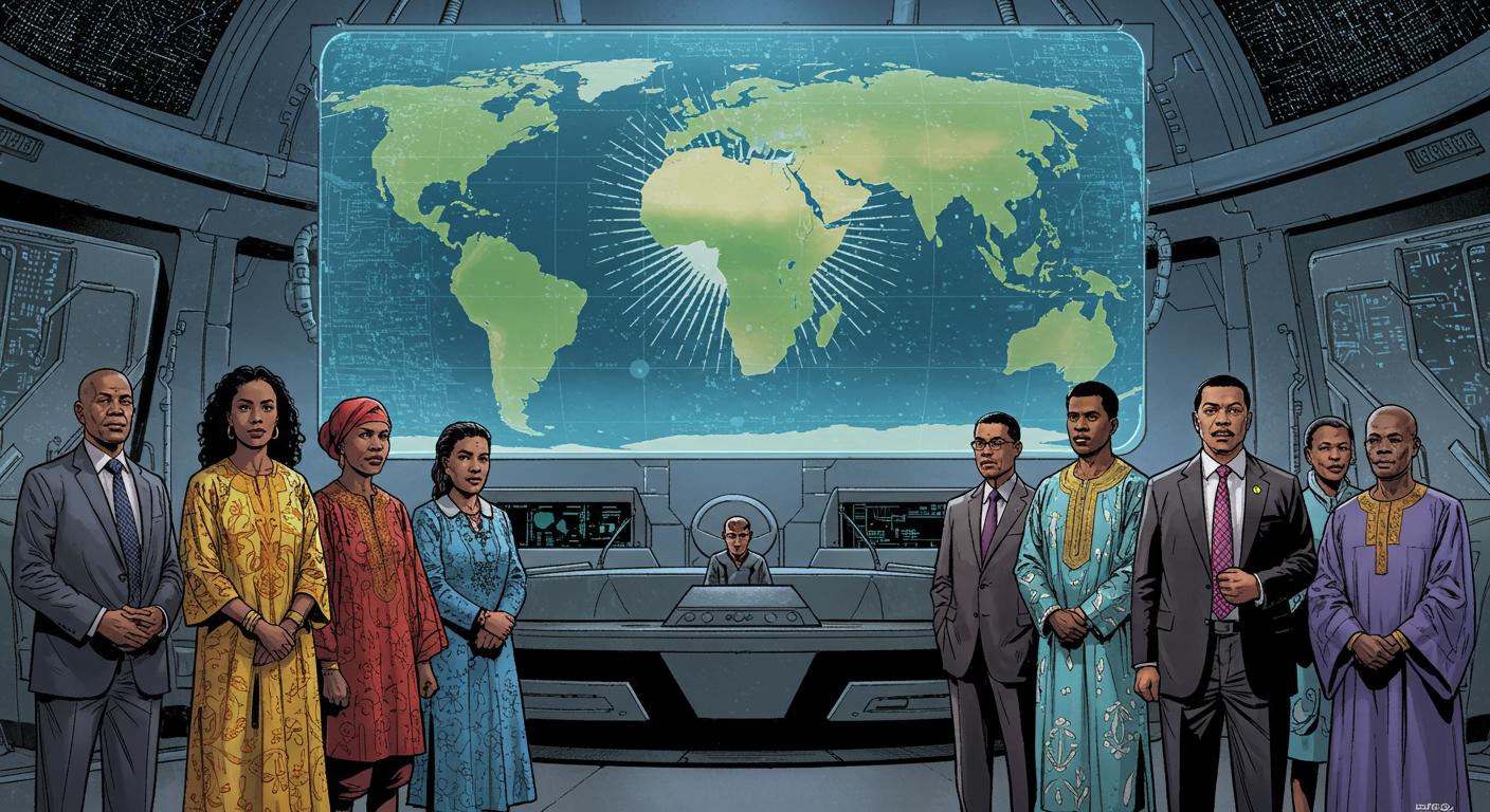
Even The New Times Rwanda highlights that the African Union has urged governments and international organizations to replace outdated world maps that minimize Africa’s presence. The misrepresentation goes beyond geography, feeding into broader stereotypes and marginalization.
The underlying issue, as AU Commission deputy chairperson Selma Malika Haddadi told Reuters, isn’t just mathematical. She cites that Mercator’s legacy fosters a “false impression that Africa was ‘marginal,’” rather than acknowledging Africa as the world’s second-largest continent with over a billion people. This distortion, Haddadi argues, ripples out—fueling stereotypes, shaping curricula, seeping into media, and even coloring the policies that affect millions.
Unpacking the Campaign for Change
Enter the “Correct The Map” campaign, a crusade spearheaded by advocacy groups Africa No Filter and Speak Up Africa, two organizations with little patience for centuries-old errors. Their preferred replacement is the 2018 Equal Earth projection—an attempt to present countries at their truthful relative sizes, with less bias and more, well, actual area.
It’s hard not to hear the humor (or the slow burn of exasperation) in Moky Makura’s observation, quoted by both CNN and Faharas News: “The current size of the map of Africa is wrong. It’s the world’s longest misinformation and disinformation campaign.” That’s roughly four centuries of small-print rebranding, all on classroom walls.
The push isn’t just about spatial accuracy. Fara Ndiaye, co-founder of Speak Up Africa, emphasized to Reuters the distortion has consequences for identity and pride—especially for children growing up seeing their continent as something insignificantly small, squeezed awkwardly into lower corners. She describes an active effort to make Equal Earth the mainstay in African classrooms, hoping the sight of a right-sized Africa might shift more than just perceptions—it might adjust self-image.
Africa’s campaign aligns with broader decolonization movements. CNN notes, and The New Times also highlights, that the shift is tied to wider calls for reparations over colonialism and slavery, with Haddadi positioning map reform as part of an effort to “reclaim Africa’s rightful place on the global stage.” Subtlety, meet door.
The Cartographic Domino Effect
Globally, this isn’t happening in a vacuum. As noted by Uzalo News, the World Bank has already started phasing out Mercator maps in at least some contexts, and the UN’s geospatial division is currently reviewing formal requests to make Equal Earth the new standard. Even Google Maps, that digital oracle of “how late am I really?”, has switched to a roughly globe-shaped projection on desktops since 2018—though Mercator remains the default for mobile users, because old habits (and code) die hard.
Support for map correction isn’t limited to Africa. Both Faharas News and CNN document that the Caribbean Community’s Reparations Commission has thrown its weight behind Equal Earth, denouncing the Mercator as a lingering artifact of “power and dominance.” The symbolic resonance isn’t hard to spot.
Still, the Mercator’s reliable presence, especially in education, means this change—should it take root—will represent a meaningful shift in the way younger generations see the world. Will seeing a right-sized Africa, without the geographic gaslighting, tweak the collective global psyche? At a minimum, geography teachers may suddenly have fewer students asking if Russia could hide the Sahara behind its eastern border.
Is It Really Just a Map?
This is the part of the story where most people might be tempted to say, “Well, so what? It’s a map—a tool. Who cares about the picture as long as the information gets you from A to B?” But as researchers, educators, and campaigners tirelessly point out, maps aren’t just about wayfinding. They’re stories about who matters, who gets crowded out, and who ends up squeezed into forgotten margins.
The African Union’s campaign is about more than cartographic justice; it’s about, as Haddadi put it, “reclaiming Africa’s rightful place.” It’s an overdue acknowledgment that representation—however quietly delivered, be it on a chalkboard or a smartphone screen—matters.
Looking at the Mercator’s slump toward retirement, you have to wonder: what other persistent quirks of the everyday—things we’ve long stopped questioning—have been quietly shaping our worldview? And, now that we’re seeing one of them, how many more funhouse mirrors are left for us to smooth out?